-
-

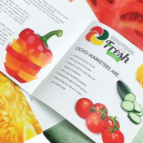
OGVG
Digital Design -
Cartel Marketing
Digital Design -

PBL Insurance Ltd.
Digital Design -

Arrow Mailing Canada
Digital Design -

PMCOS
Digital Design -
WCA
Digital Design -

Thompson Emergency
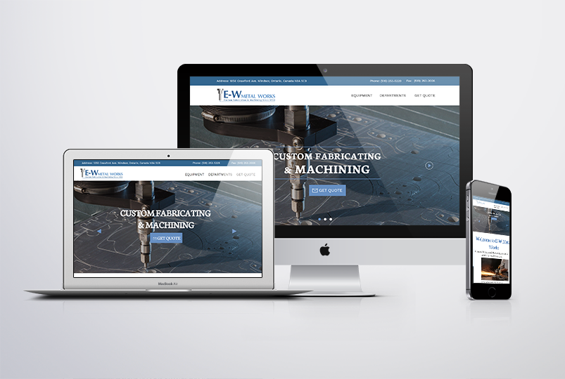
Digital Design -

E-W Metalworks
Digital Design -

ITOS Oncology
Digital Design -

Unconquered Sun Solar Technologies
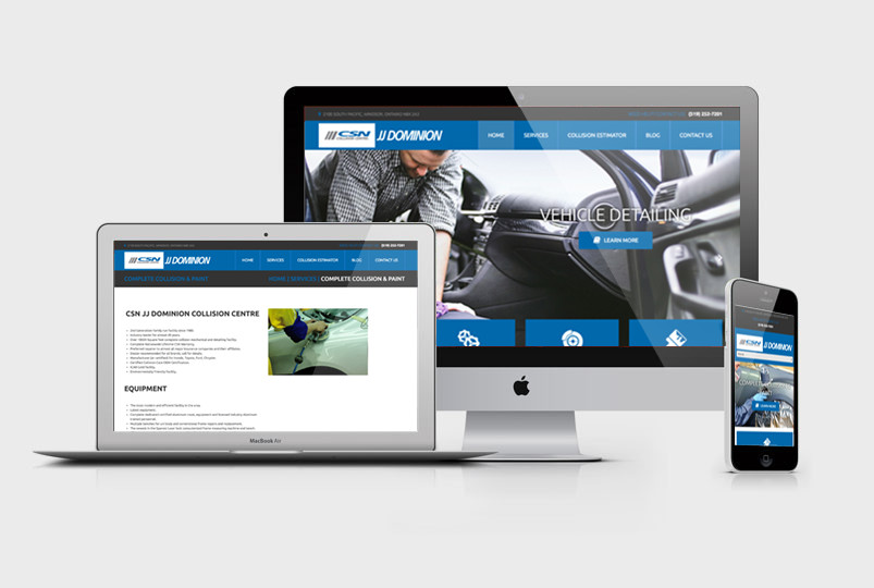
Digital Design -
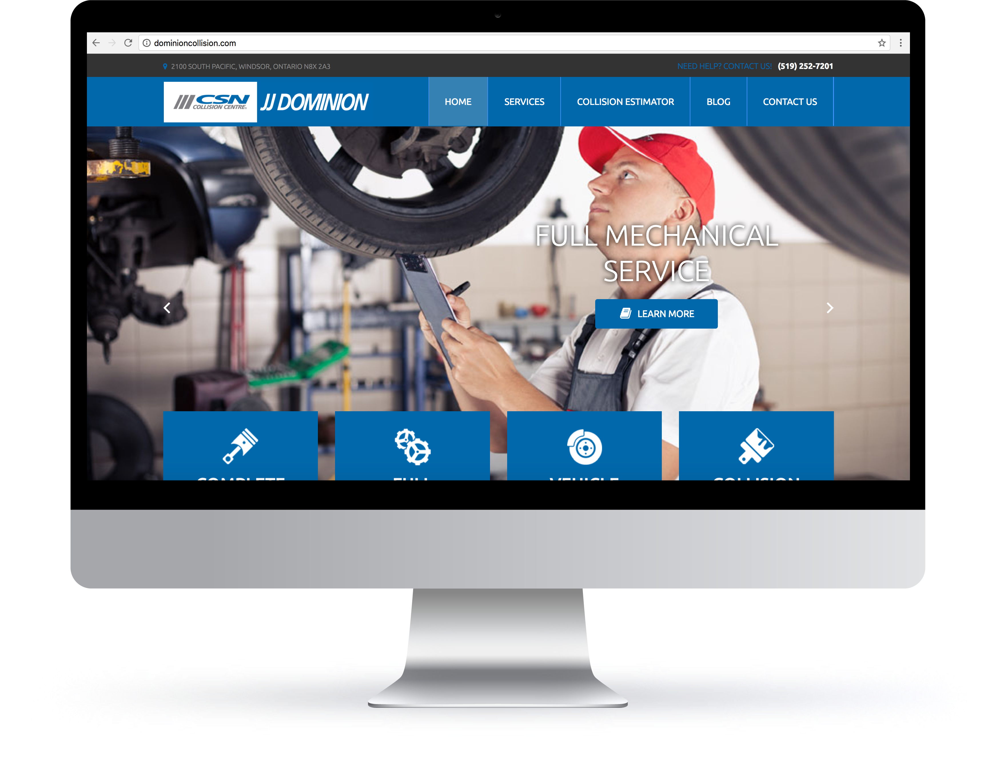
J & J Dominion Collision Service Ltd.
Digital Design -

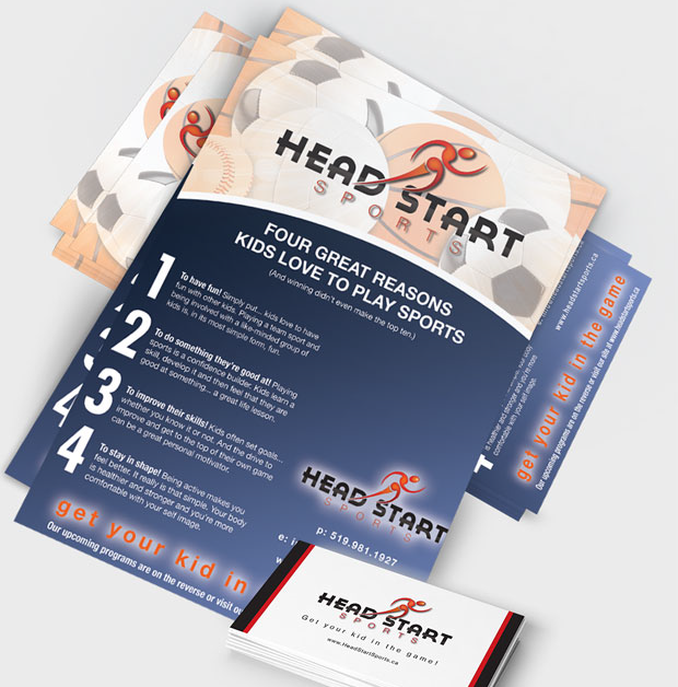
Head Start Sports
Digital Design -

HCAW
Digital Design -
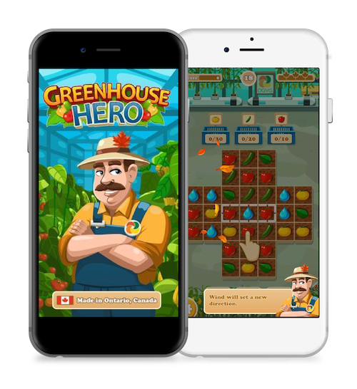
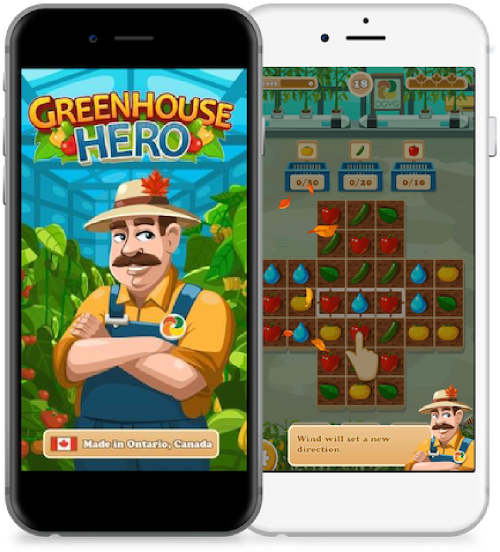
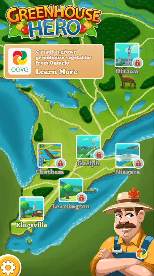
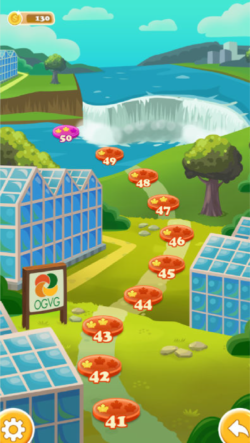
Greenhouse Hero
Mobile App -

Thompson Emergency
Mobile App -

Fit Test
-
OGVG
Traditional Design -

Thompson Emergency
Traditional Design -

WCA
Traditional Design -

Hummazing
Traditional Design -
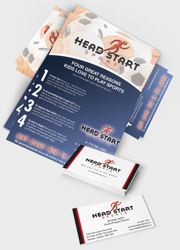
Head Start Sports
Traditional Design -
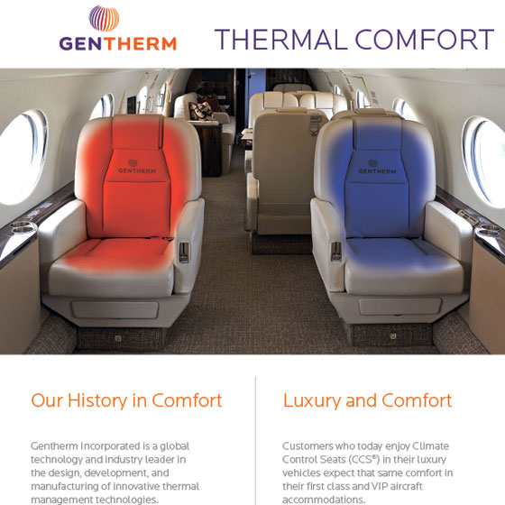
Gentherm
Traditional Design -

Fingerprints Massage
Traditional Design -

Great Lakes Technical
Traditional Design -
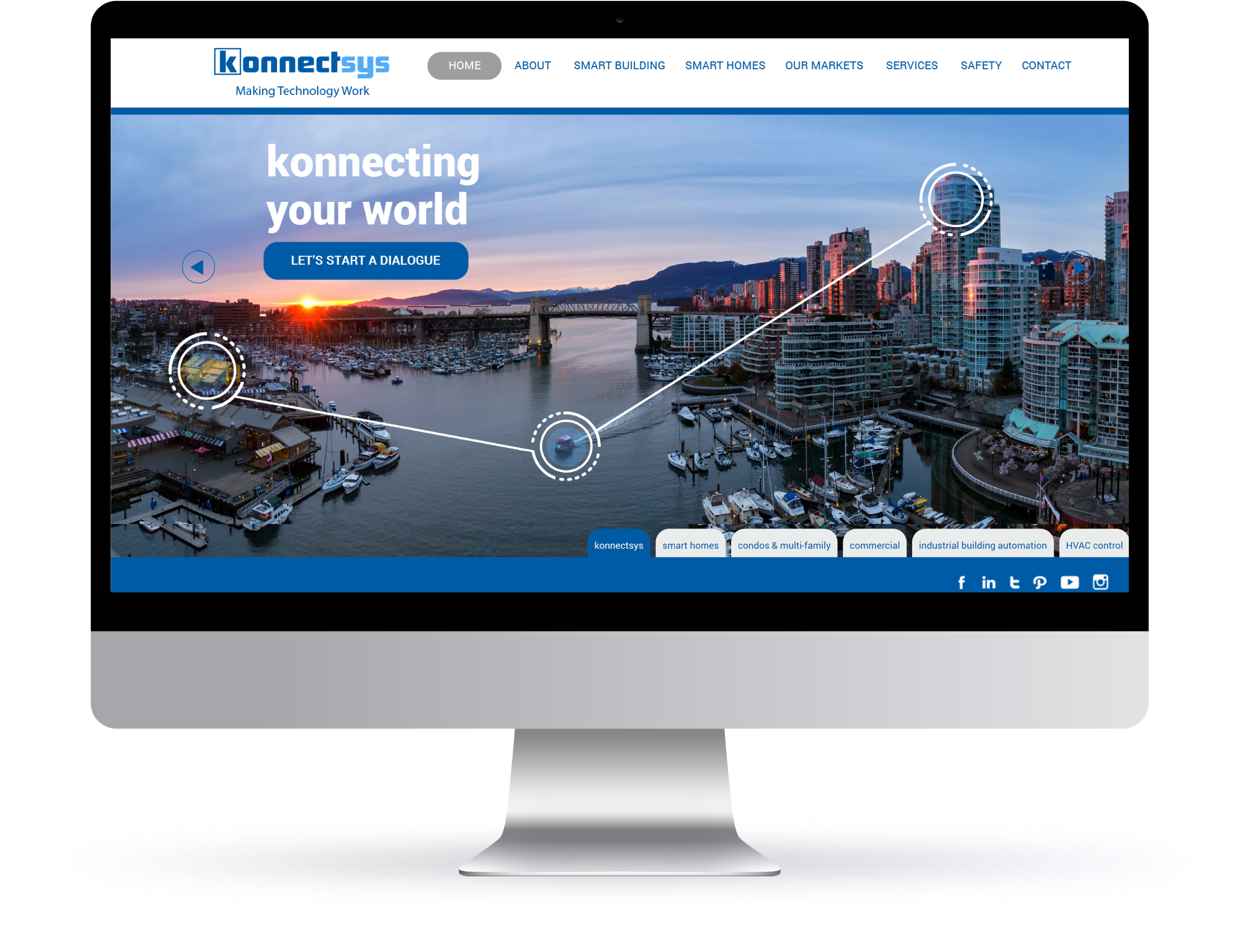
Konnectsys
Logo Design -

OGVG
Logo Design -

Head Start Sports
Logo Design -
Cartel Marketing
Logo Design -

AssureChem
Logo Design -

Haller Home
Logo Design -

Grand West Dental
Logo Design -

Spada Sheet Metal
Logo Design -

HCAW
Logo Design -

Kindree Electricity
Logo Design -

Summit Heating & Cooling
Logo Design -

WCA
Logo Design -
Thompson Emergency
Logo Design -

Sandwich West Dental
Logo Design -

Trademark Oil
Logo Design -

Great Lakes Technical
Logo Design -
OGVG
Case Study -

Thompson Emergency
Case Study -
WCA Case
Case Study -

Head Start Sports
Case Study


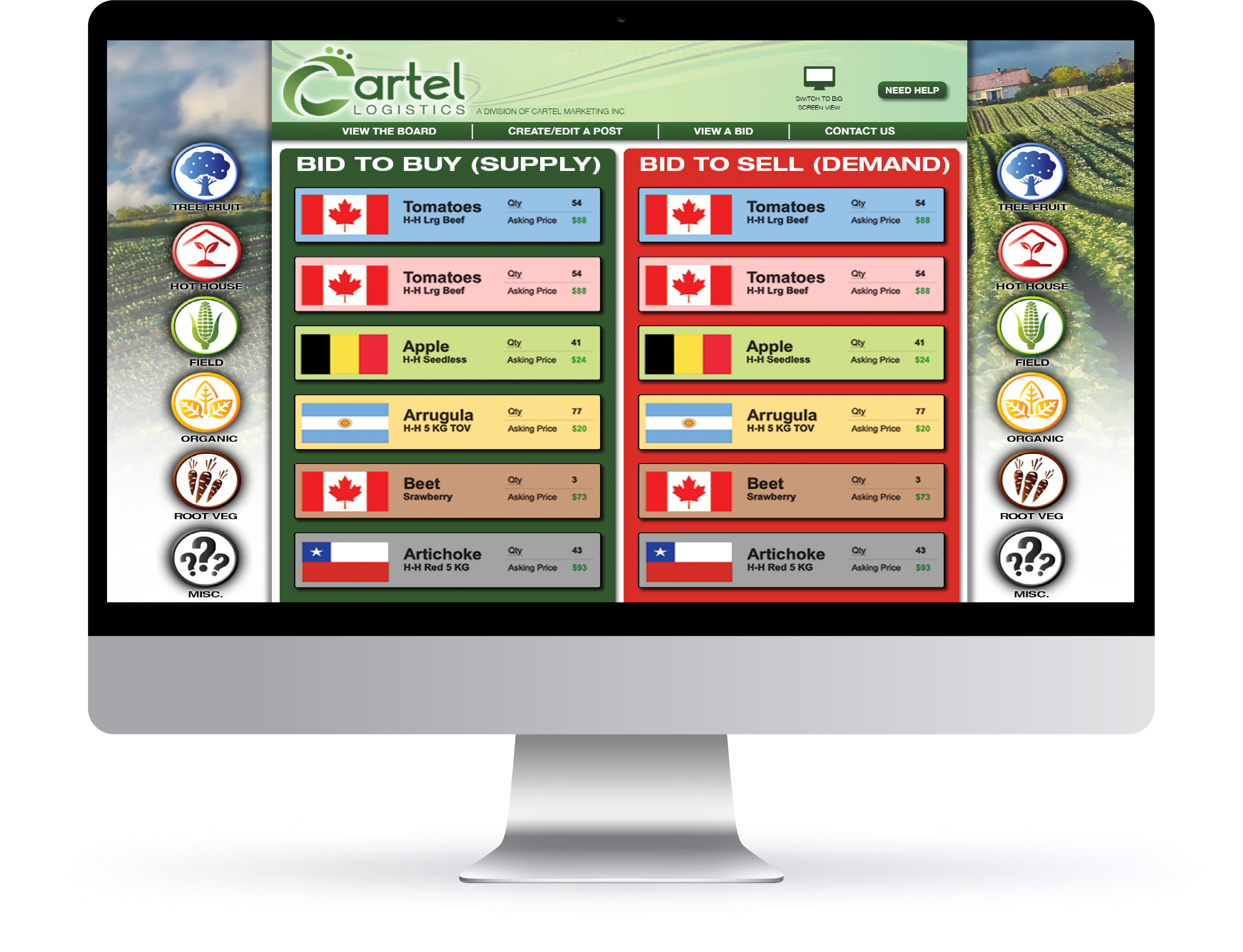
Cartel Marketing Website Design
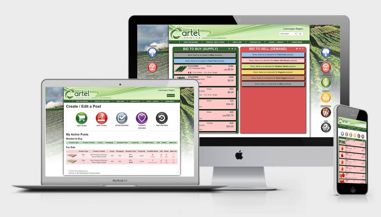
The original Cartel Marketing Website, an auction-style bidding site for wholesale fresh vegetable and fruit was built almost 15 years ago and had begun to show it’s age. Cartel Marketing, on the advice of JEV Marketing, decided to rebuild and renew the website with additional functionality and a new visual appeal.
JEV Marketing & Communications created a new, visually appealing, and appropriately themed platform for the site but the real depth to this site is in the back end programming. The site maintains a fully automated auction system that allows competing growers to bid on each others products in order to fulfill an order that they may otherwise come up short on. The site updates the bidding system, available products and purchased product on a minute by minute basis. After orders have been committed to and the invoice has been paid or covered by a pre-established credit amount the order is automatically scheduled by the website. The fully automated bid, purchase and delivery all happens without the buyer and seller (who come from competing grower agencies) ever meeting. The system has been such a success locally that plans are in place to launch operations in various other grower locations in Ontario and Quebec.


Gentherm Flyer Design
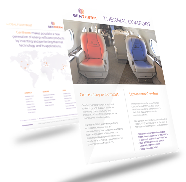
The Gentherm flyer was created under strict branding guidelines as a promotional piece to be distributed to the elite, private airline industry along with a variety of other flyers. The flyer was printed on a high quality satin stock and then washed in a matte UV coating with spot UV added to imagery and logos to make then pop.
Fingerprints Massage Brochure

Along with the development of their new website JEV Marketing also suggested a rebrand of their old and outdated print collateral. A simple tri-fold brochure was designed that reflected the look and feel of the new website. The new brochure was to be used as a take home piece for clients and as a distribution piece when the services of Fingerprints were recommended by health practitioners in the area.

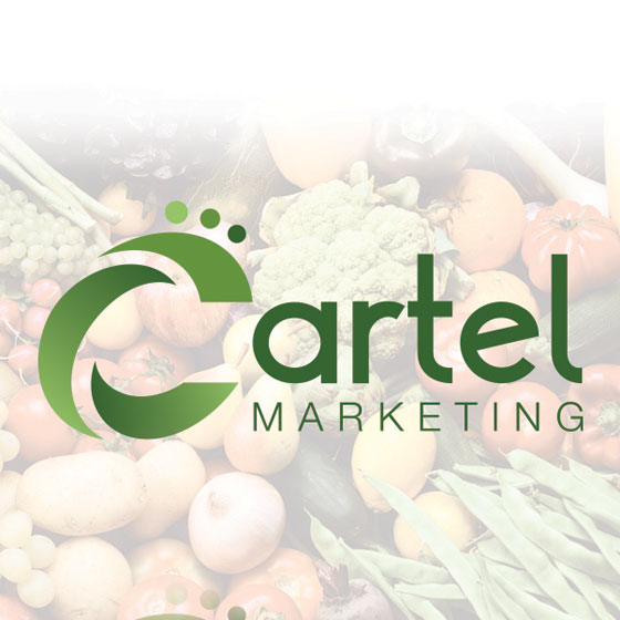
Cartel Marketing Logo Design


The Cartel Marketing brand was created using a great deal of symbolism. The name itself, as defined historically, means “a coalition or cooperative arrangement between parties intended to promote a mutual interest” which, in this case, the competitive distribution of produce grown in the Essex and Kent county area. The choice of green as the predominant colour is used to represent the industry focus on the natural environment. The iconic “C” in Cartel is broken into three flowing curves to suggest motion and the three dots are representative of the grower members sitting together at a table to negotiate the best deal for all involved. A strong, bold, modern typeface was chosen to reflect the forward thinking attitude of the site and the method of operation in an entirely digital realm.
Grand West Dental
Grand West Dental has been a longtime provider of quality dental care for the residents of Chatham Kent County but has never had a brand that represented themselves properly as one the largest oral care providers in the region.
A review of the image and professional standing that they wanted to portray was analyzed and the colours choice and font were chosne based on these requirements. The font is strong and prominent with a modern flair but it also uses a serifed accent to convey a connection to the past. The colours of bright blue and green are soothing as well as clean and professional. They are also two colours that are particularly reflective of the health care industry.
The iconography in the logo uses tooth imagery in order to directly associate the health care provider with dental care and the addition of the compass is both a directional play on the business name Grand “West” as well as being suggestive of the clients being on the correct path to good dental hygiene.
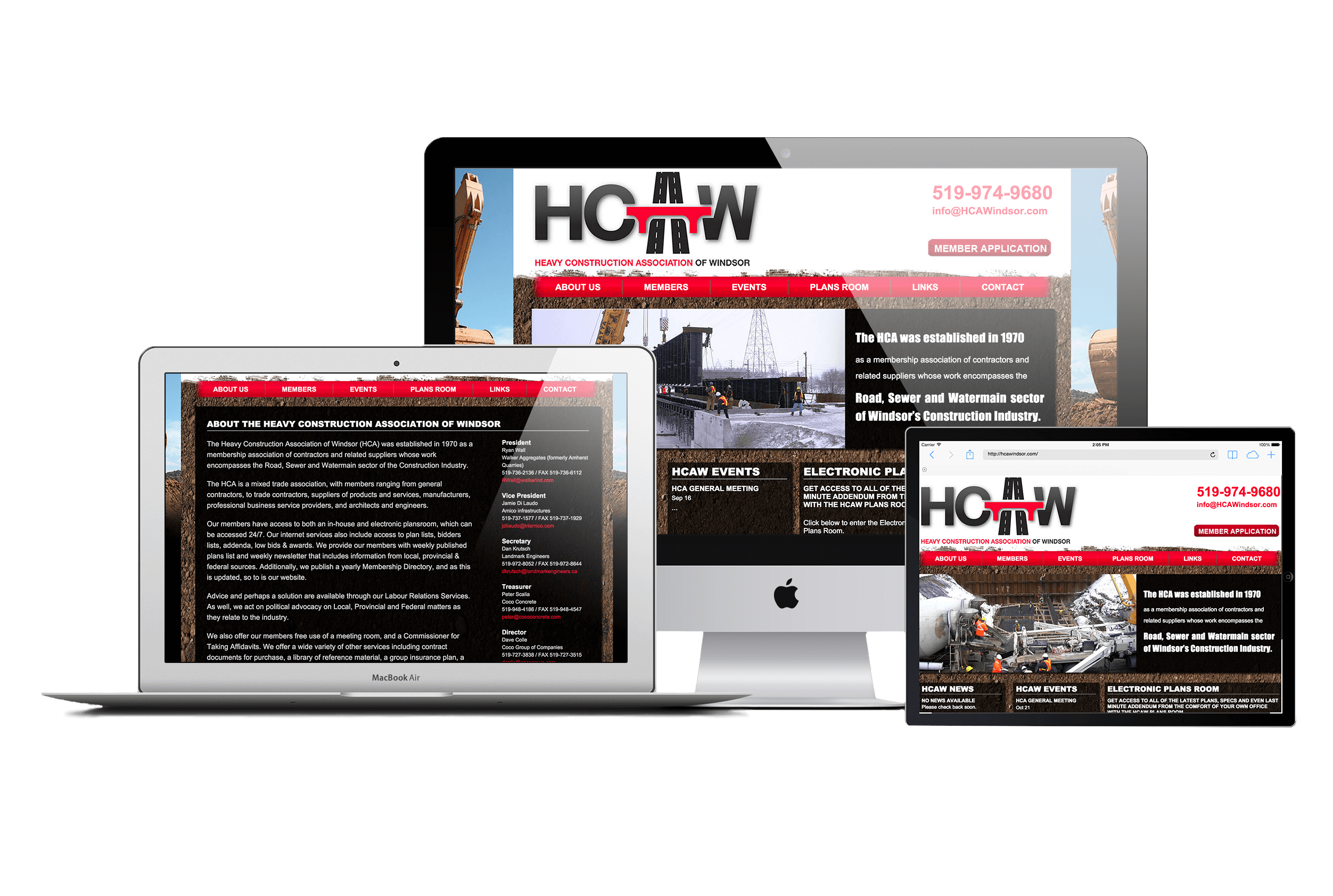
Heavy Construction Association Logo
The Heavy Construction Association of Windsor was looking for a rebrand of a logo created… before time began. The old logo image was lost to antiquity and, essentially a copy of a copy of a copy was being used now as the source.
A fresh start was needed as it was determined that nothing was salvagable from the original crest other than the colour. A bold, solid and strong typeface was chosen as the base. The lead letters from each word were use as an acronym that is commonly used to refer to the association. Within this acronym a graphic, that is commonly used in maps to represent a bridge over a highway, was added to the letter “A” as bridge building is a mainstay of the heavy construction industry.
Great Lakes Technical Logo Design

Great Lakes Technical Training is a local government approved educational facility for the training of heating and cooling professionals as they start their journey through the trades as an apprentice.
With GLTT having a main focus on residential and industrial heating and cooling the brand colour and general graphic focus was an easy task straight out of the gate. Furnace burners emit a blue colour and glow when tuned properly and the owner was insistent that this feature was conveyed in his imagery. Thus the choice of blue as the predominant colour. The flame imagery was also selected after a review of a variety of burner styles that would be used in the heating industry. The words “Technical Training” were reversed within a bar and then a line of carefully coloured blue flames were added to look like they were burning out of the element. A large, and more intricate blue flame were added to divide the business name and create a dynamic feel. A bold and easily readable font was chosen to balance out the intricate imagery in the logo.
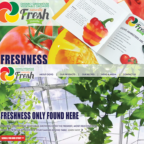
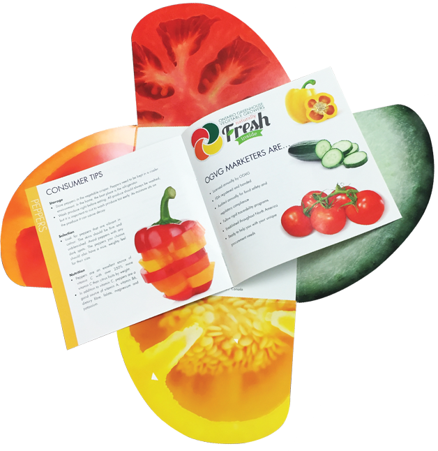
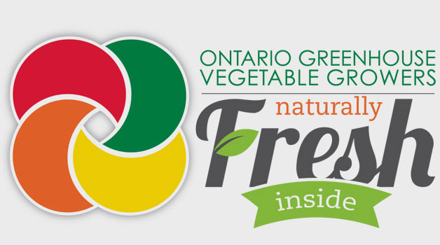
Ontario Greenhouse Vegetable Growers
Ontario Greenhouse Vegetable Growers (OGVG) is a not-for-profit organization representing 218 members who grow greenhouse tomatoes, cucumbers and peppers in Ontario, Canada.
OGVG was formed in 1967 and is responsible for licensing all growers, packers and marketers of Ontario greenhouse tomatoes, cucumbers and peppers. As a whole, OGVG strives to support the Ontario greenhouse vegetable sector and its growers, however possible, to ensure success for today, sustainability for tomorrow, and fresh, nutritious, quality produce for all!
With 218 greenhouse growers in Ontario who produce tomatoes, peppers and cucumbers spanning from Windsor to Niagara and as far north as Ottawa; the greenhouse vegetable sector is a powerful economic force in Ontario. The latest numbers reveal farmgate sales for Ontario tomatoes, cucumbers, and peppers of $783 million in 2013.
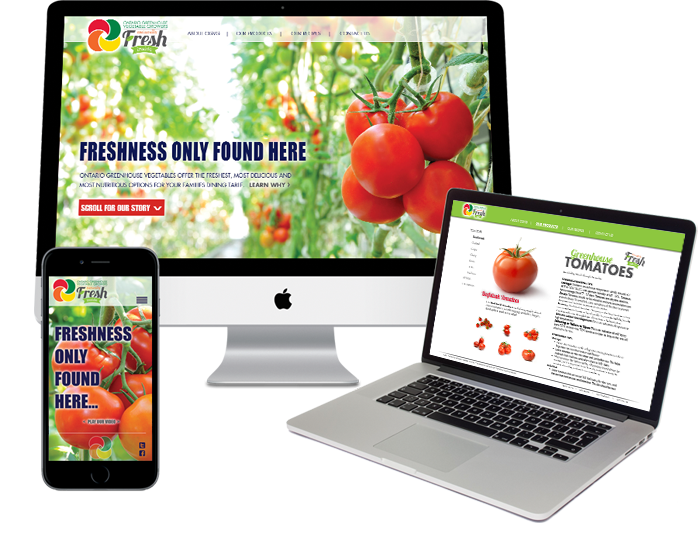


Problem Definition
The OGVG has struggled with an online identity that fits with their forward thinking and dynamic attitude towards growth and development. Their old website had limited features and content that was appropriate to both the buying market that they served and the general consumer. On top of that it had poorly organized content that was hidden or ignored by Google Search parametres, thereby requiring consumers to directly search the name in order to produce any results directed at the OGVG.

Solution Definition
OGVG commissioned JEV Marketing & Communication to develop a unique, modern and interesting platform for their new website. The site that was developed incorporated brilliantly coloured video and motion into the website functionality that created an interesting and fun destination for visitors. A supporting mobile version with full content was also developed to keep OGVG in communication with those consumers on the go.

Solution Results
The new OGVG website has had various social media integration built directly into the site that help to drive consumers to specific areas of interest such as recipes, video and produce care information. As a result of the development of the new website and it’s fully integrated functionality OGVG has seen a 50% growth in the number of visitors to the site as well as lower bounce rate and greater depth investigation.
Additional Design Components
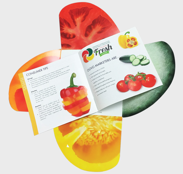
Along with the new website, the OGVG’s flagship campaign logo “Naturally Fresh Inside” was redeveloped with a more modern look and feel in mind. The new logo is bolder, cleaner and less cluttered than the previous rendition with all required elements being included in a single image. OGVG also partnered with JEV to create an interesting tradeshow marketing piece that included a die cut folder, trimmed in the shape of their master logo with a 16 page booklet inside that contains all the information a prospective produce buyer might need to make an informed decision on the quality of OGVG’s partner growers.
Thompson Emergency Freight
Since 1985, Thompson continues to successfully service international points between Canada and the United States (including domestic Canada), door-to-door direct. Thompson’s ownership remains unchanged, still leading the way, 30-years later. Stable ownership, coupled with strong management, empowers Thompson’s staff to focus solely on our customers and with an unrelenting commitment to provide real value to our customers, Thompson has grown into one of the largest Canada-U.S.


Problem Definition
Thompson Emergency Freight had a seriously outdated website that had been corrupted several times through various hacks and viruses. It had also been set up to be a client managed site but most areas had been left alone and not updated. The site contained outdated information or incorrect information that was becoming detrimental to the day-to-day operations of their business.

Solution Definition
Thompson commissioned JEV Marketing & Communication to develop a functional, intuitive and interesting platform for their new website. The site that was developed incorporated parallax scrolling using industry imagery and Thompson trucks shot specifically for the new look launch. There was also a series of custom user interactives developed for freight negotiations, partner log in and driver recruitment. The driver recruitment system has allowed Thompson to prescreen eligible drivers before any interaction with recuiters has even happened. Further to this, all newly developed site functionality is available on any mobile friendly device.

Solution Results
The new Thompson Emergency website has integrated newly developed custom software that will allow the Thompson staff to provide better service online in a fast paced logistics environment. The development of all new web-based systems has allowed Thompson to become a technology leader in a service oriented industry.
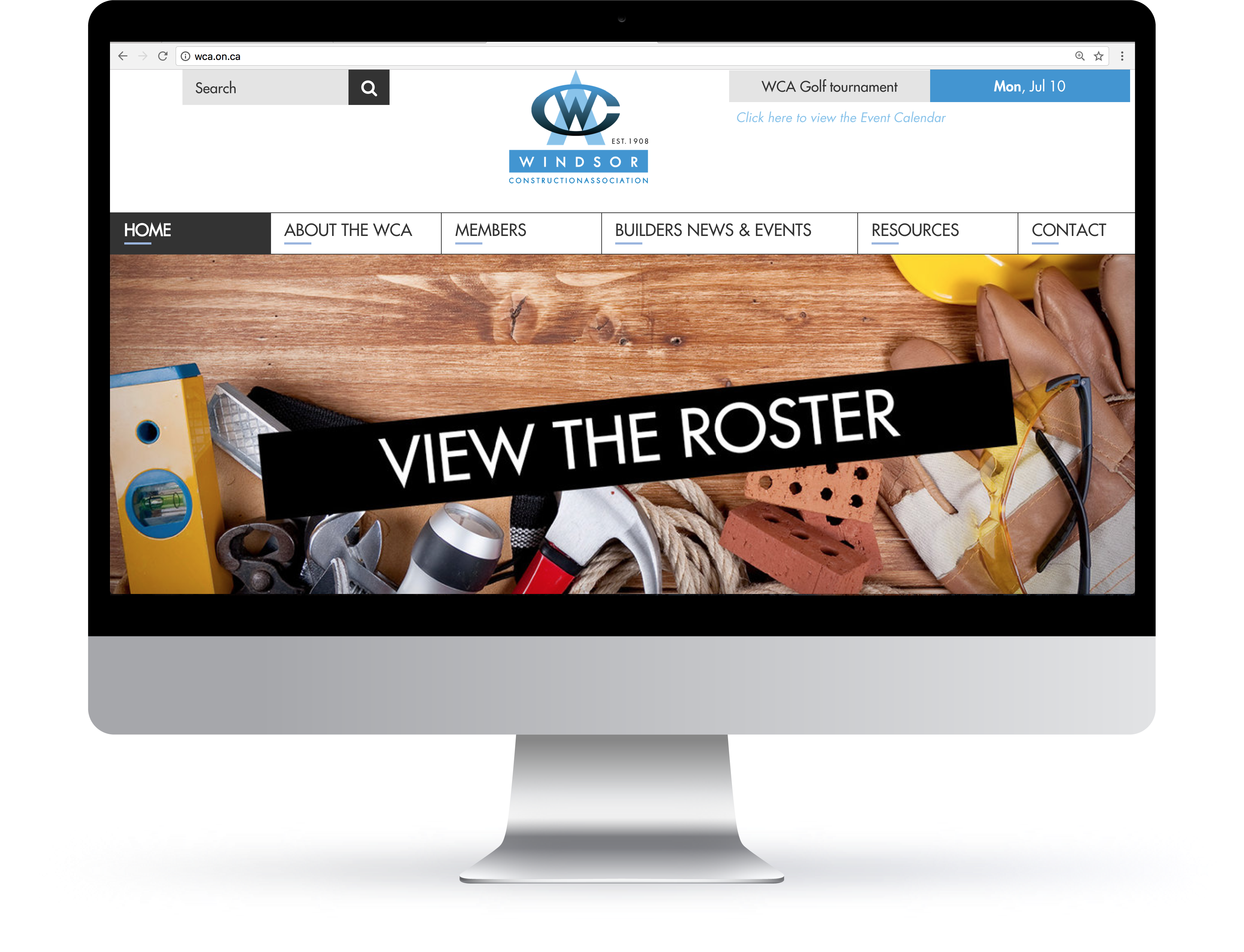
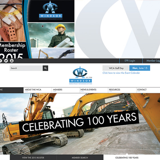
Windsor Construction Association
The Windsor Construction Association, a membership organization, working for the promotion of local contractors, subtrades and suppliers has been the voice for a high standard of ethics, education, safety, environmental practices and training in the Windsor and Essex County area. The WCA manages a plans room for building projects at it’s brick and mortar location as well as an online system that allows builders to view, print off and bid on local construction projects along with a members roster and various newsletters and support functions.


Problem Definition
The WCA has maintained, printed and distributed a traditional roster list for all of its members to use as a phone book. The members list was also available on the WCA website but because the website was becoming outdated there was no viable mobile option and limited functionality. The roster was also a significant financial cost that was only covered by substantial advertising sales support. The site also had several outdated and unsupported functions such as flash that was limiting its use as a resource as well as being difficult to navigate.
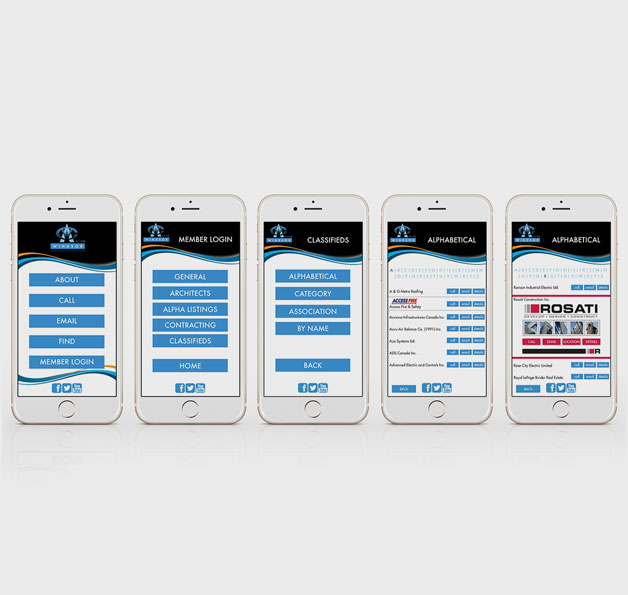
Solution Definition
The WCA partnered with JEV Marketing to develop a solution to their website concerns and in the process JEV offered an opportunity to take the roster into a completely digital format. Thereby becoming the first Construction Association in Ontario to go fully digital and mobile friendly. The new website is easier to navigate and uses all modern and up to date technology along with having a fully functional mobile site that also supports a searchable, easily updatable roster with one touch call capability. This new mobile roster will eliminate the need for the expensive and wasteful printing of a paper roster.

Solution Results
The new mobile roster has helped save the WCA the cost of the printing of the traditional roster and has become a viable advertising platform for their membership. It also eliminates the concerns of a mistake being printed and circulated for a full year before a correction can be made as the digital version is immediately updatable. The new website and mobile platform are also more search engine and content friendly. This venture into a fully digital format has also put the WCA back on the cutting edge of technology with its industry.
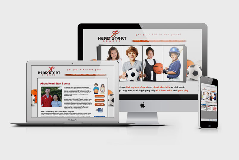
Head Start Sports
The Head Start Sports Youth Club is a non-profit organization committed to fostering a lifelong love of sport and physical activity for children in Windsor-Essex through programs providing high quality skill instruction and game play. They are dedicated to giving elementary children a head start to becoming healthier and more active participants in a variety of sports and games!


Problem Definition
Headstart Sports launched their new business model in the Windsor area and as the first private, youth sports club they had some unique challenges. This style of business model had never been attempted before as this style of program was usually run by municipalities or dominated by local sports clubs. The challenge was going to be how to overcome this control of the market and introduce a private club to the mix.
Solution Definition
Headstart Sports worked closely with JEV to develop a dynamic and energetic brand first. The logo created used a predominant, bodly coloured running man overlaid onto a modern, bold typeface. Great care was taken in using a sports figure that was both gender neutral and generic with regards to sport. Headstart would be featuring a variety of sports and did not want the iconography to feature one sport in particular. The next step would be the development of a website to help announce the new business, inform the local public of it’s various sports initiative and offer a way for parents to sign their kids up all in one easy step. The new website used select photos of a broad spectrum of children enjoying a variety of sports in a fun and inclusive environment. Also included was a series of printed pieces to be distributed at local schools directly into the hands of the target market… parents of children, ages 6 to 13. As the popularity of the program grew the print portion of the marketing program has been reduced in favour of social media, email blasts and SEO based internet marketing.

Solution Results
Headstart Sports went from an unknown entity within our market, to establishing themselves through solid marketing principles, to achieving a level of success that has seen a doubling of their program offerings in just three years. Headstart Sports has not only managed to completely fill all of their classes for every program that they have offered… they have even doubled the amount of courses they offer with continued waiting lists for the more popular sports.